The Illustrative Genius of Satyajit Ray
Satyajit Ray, the acclaimed Indian filmmaker, is widely known for his masterful contributions to world cinema. However, Ray’s exceptional talent as an illustrator often goes unnoticed. In his lifetime, he created over 1,500 illustrations, showcasing his creativity and skill beyond the realm of filmmaking.
Starting as a visual artist early in his career, Ray designed book covers and logos for various clients, illustrated books, and even created typefaces in both English and Bengali. He also sketched and designed film posters for his own films, including the iconic poster for Pather Panchali (The Song of the Road), which first brought him international recognition.
Ray began his professional career as a junior visual artist at the age of 22. Film was nowhere on the horizon and this was 13 years before the release of Pather Panchali, the iconic film that brought him acclaim and flagged off his journey as the legendary filmmaker that he became. But choosing to become an illustrator was not a random decision.
In his autobiographical book Jakhan Chhoto Chhilam (‘During My Childhood Days’, 1982), Ray mentions that his grandfather Upendrakishore Ray Chowdhury was a pioneer of modern block making in South Asia. He also published a monthly magazine Sandesh, the first Indian magazine for children.
Ray’s father, Sukumar Ray, had studied photography and printing technology in London, and was a pioneer in these fields in India. He was also an illustrator of repute, his sketches, paintings and cover designs a treasure of the arts.
Ray followed in the footsteps of his father and grandfather and added his creative genius to their legacy. After he graduated in Economics from Presidency College, Calcutta, Ray studied the arts at Vishva-Bharti, the university founded by Rabindranath Tagore in Shantiniketan. Until then, he had been under the sway of the Western tradition in art but the two and a half years he spent at Santiniketan opened up the magnificent world of Eastern art to him.
Chinese landscapes, Japanese woodcuts and miniatures enriched Ray’s artistic palette and, under the influence of his mentors Nandalal Bose and Benode Behari Mukherjee, he travelled to Ajanta, Ellora and Khajuraho, to explore ancient Indian art and sculpture. In his book My Years With Apu (1994), he describes that trip as an “eye-opener” in his life.

Early Phase of Ray’s Career
Satyajit Ray’s very first illustration was published in 1942 in the magazine Mouchak. According to the book Rong Tulir Satyajit by renowned cartoonist Debasish Deb, he sketched it for the short story Attache Case written by Kamakkhi Prasad Chattopadhyay.
The plot revolved around four thieves who cheated an innocent co-passenger inside a train compartment. Ray composed the frame from a top angle, to give full expression to the characters and what they were wearing. Since it was a fun story, Ray added a comical flavour to his illustration.
Ray’s first formal job was with a British advertising agency called D J Keymer, who appointed him as a junior visual artist In April 1943.

A couple of years later, Ray’s boss at the agency, Dilip Kumar Gupta, set up his own publishing house called Signet Press and appointed Ray as a part-time book-cover designer. It was here that Ray began to really shine as an artist. During the ten years he worked with Signet Press, he designed the covers and title pages for around 90 books.

The first book jacket he designed at the publishing house was for the book Khirer Putul (1943) written by Abanindranath Tagore. This was a folktale and Ray’s design is memorable for the colours and calligraphy he used, to turn it into a Bengali motif. The way he wrote the names of the title and author resembles a Bengali folk painting style called Alpana. For the illustrations, Ray used the same artistic style in linocut painting, and eloquently depicted the lyrical village life of Bengal.

Apart from the cover design, Ray also illustrated the book Aam Antir Bhenpu (1944), an abridged edition for young readers of the classic Bengali novel Pather Panchali by Bibhuti Bhushan Bandopadhyay. The illustrations are masterpieces and a sort of encyclopaedia of life in rural Bengal.
During his time with Signet Press, Ray illustrated the books of many well-known authors including that of his grandfather Upendrakishore Ray Chowdhury, whose novella Rajkahini leads the reader to the flowing sand dunes of Rajasthan, to the clash of swords and the courtyards of kings and queens.

Instead of typical illustrations that depicted heroism and bloodbaths associated with battles and war, Ray drew his frames on the lines of Rajput miniature paintings. However, he discarded the traditional excessive decoration in favour of using white space. This made his compositions more realistic and they synced beautifully with simple village life.
Ray’s journey with Signet Press ended in 1955, when he got busy with filmmaking. He had also revived his grandfather’s magazine, Sandesh. During this phase, his illustration work can be categorised thus: Illustration of his own literary work; cover design and other illustrations for two magazines Sandesh and Ekkhon; design of movie sets on paper and illustration in scriptwriting; and the design of cinema posters and title cards.

Illustration for Sandesh
Ray revived Sandesh, a magazine for children that had been launched by his grandfather Upendrakishore Ray Chowdhury. To make the magazine even more appealing to children, he illustrated it himself. He did more than 1,000 illustrations for Sandesh.
Ray created four comic strips for Sandesh. He was fond of European and American comics but his comic strips were ’silent’ – the characters didn’t converse with each other; silence was the vehicle of the socio-political messages that Ray wanted to convey.
In the above strip, a middle-class, middle-aged gentleman goes to purchase firecrackers to celebrate Diwali with his kids. He returns home in a delightful mood but cannot tolerate the sound of the crackers at night.
Illustrations for his own Literary Works
Satyajit Ray’s fictional works can be placed in four categories – the Feluda detective series; the adventures of Professor Shonku, the adventures of Tarini Khuro; and other assorted stories. His fiction was targeted mainly at teenagers.

In his short story, Bonkubabur Bondhu, Ray introduces an alien to the world and illustrated his idea of the anatomy of an alien. Some say the alien in the famous Hollywood movie E.T (1982) directed by Steven Spielberg was modelled on Ray’s illustration. In fact, it was world-famous science-fiction writer Arthur C Clarke who recommended that Ray take his script to Hollywood in 1967, hoping to get a studio deal to make the movie.
Ray loved to create a sense of mystery through the use of silhouettes via line drawings. In the horror story Brown Shaeber Bari, a bungalow is placed a very specific distance from the two viewers peering into it. Through the use of visual distance, Ray whipped up mystery and the solitude of the place.
For his detective character Feluda, his sidekick Topshe and friend Jatayu, Ray used the same line sketching in pen. With just a few tweaks of the lines, he created suspense.

In the climax of Badshahi Angti, Feluda and Topshe are taken to a wooden lodge inside a forest. Through the use of techniques such as wide angle, shadows, silhouettes and other deft strokes of the pen, Ray conjures the mysterious aura that the story needed.
Professor Shonku is a fictional scientist and inventor created by Ray, and is popular in Bengali literature. Initially, Ray used pen and ink to illustrate the stories of Professor Shonku. Here’s an illustration from the story Moru Rahashya, where Ray sketches the Sahara Desert. He composed the frame from a top angle to depict the vastness of the vast sandy expanse.
Placing a pyramid in the background and using perspective, he drew the human figures in smaller shapes. The illustration clearly shows how two scientists (Professor Shonku and his friend Dr John Somerville) were struggling to ride a circular shape.

Design of Movie Sets on Paper and Illustration in Script Writing
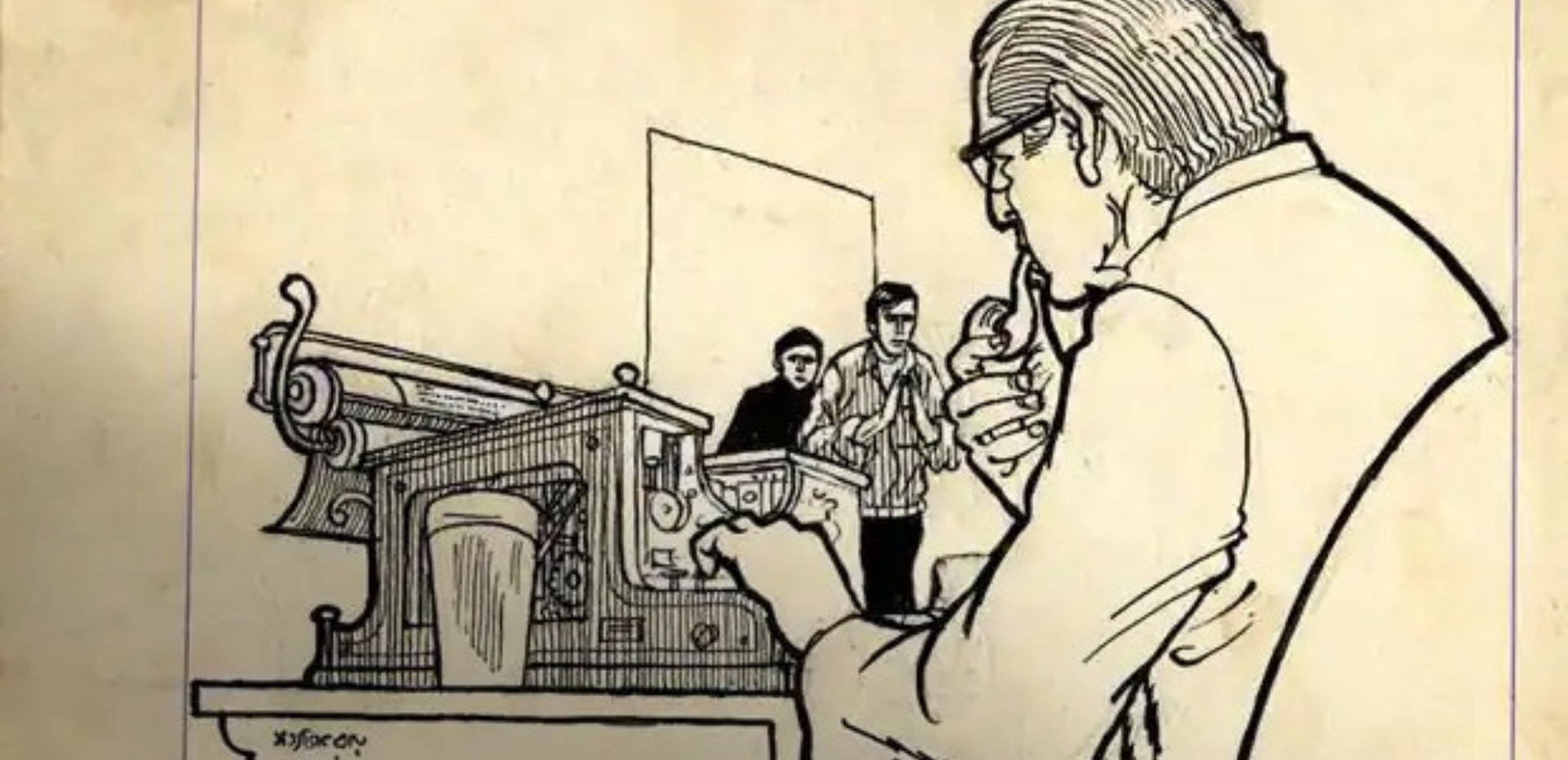
Satyajit Ray’s considerable experience in commercial art, study of ancient Indian art, Eastern art, contemporary European art and enormous imagination comes through in his in scripts. While writing the scripts of his films, Ray not only wrote the description and dialogue of the scene, but also illustrated the scenes using pencil, pen, pastel colours and watercolours in a scrapbook. This minimised the need for art directors and cinematographers, and also saved time
For his first film Pather Panchali, Ray did not write a script. Instead, he created a storyboard by drawing each scene sequentially, in comic-book style, in a scrapbook. It was this scrapbook that he showed producers.
All the drawings on the Pather Panchali storyboard were made using ink and pen in the wash method. Amazingly, when the film was made, Ray’s drawings looked identical to the still photographs of the scenes!

For the first movie with his detective character Feluda, Sonar Kella, Ray illustrated the drawing-room in the scene where the detective is introduced to the audience. He sketched and painted the scene so meticulously and with all the cultural nuances it needed that the Art Director Ashoke Bose later remarked, “I had nothing to do except follow the illustration done by him.”
Cinema Posters and Title Cards
Ray's poster designs for his films are a brilliant example of the graphic arts. Through the use of calligraphy and illustration, he brought about a revolution in this area. In his book Rong Tulir Satyajit, Debasis Deb says, “The narrative of the film was reflected in the posters designed by Satyajit Ray.”
Before Pather Panchali released, Ray advertised the film in newspapers but he did not use a single scene from the film in his promotional material. Instead, he wrote the announcement of the film’s release through the magical use of calligraphy. The advertisement was placed in a vertical column. The lines were vertically inclined; the dates were in bold; and the names of the author, music director and director (his own name) were written in a larger size. At the bottom, he sketched that iconic scene from the film, of Apu and his elder sister Durga running.
Satyajit Ray designed the posters of each of his 36 films. Also, he illustrated the title cards of all the films.

His film Kanchenjungha was based on the story of a family who travelled to Darjeeling on vacation. On the poster, Ray wrote the name of the movie in a way that resembled the Tibetan script, to mirror the complexity of the characters.
In the title card, he illustrated 12 compositions of the daily life of Darjeeling. The illustrations included a Lepcha family, a tourist party, school students, tourists sitting with newspapers in a mall and horse riding. These Oriental-style paintings established the flavour and the lifestyle of the hill town to an audience unfamiliar with the town. Even in the title cards, he moulded Bengali letters to a Tibetan style.
Satyajit Ray was undoubtedly global in his imagination of the local, and he left this mark as an illustrator in his own works and the works of others. It is a tribute to the sheer genius of this legendary filmmaker that he had another talent that brimmed in equal abundance.
Your source for unique home decor and furnishings that blend modern design with traditional Indian craftsmanship. Responsibly sourced from over 11,000 artisans, our products reflect authenticity, sustainability, and fine craftsmanship. Discover the beauty of India with Peepul Tree.